
How We Reimagined a Character Cottage Without Losing What Made It Special
Updated: Aug 12
There is a point in many renovation projects when the excitement meets the spreadsheet.
A&R had bought a home with enormous potential. It had the kind of character you hope to find in an older property: pitched roofs, distinctive gables, dark timber detailing, fireplaces and rooms with a sense of history. It also needed work.
As the renovation plans developed, so did the costs. Before committing more budget to further rounds of detailed architectural work, A&R wanted to step back and explore a bigger question: what could this house actually become?
They wanted ideas rather than another expensive round of technical design at this stage. Could they gain considerably more usable space without making the original house unrecognisable? Could the gables remain central to the architecture? Could they avoid the ubiquitous glass-roof extension? And could the finished house still feel like a warm, characterful cottage — just one designed around modern family life? That became our brief.
The starting point: a house with more potential than its interiors suggested

The existing house had character, but many of its rooms were dated and some of the available space was working far less hard than it could. That immediately shaped our approach: we did not want to design a completely different house around it. We wanted to understand what was worth keeping, then make the new ideas feel as though they belonged.
How do you add more without taking away what makes the original property interesting?
The big idea: make the house larger, not less characterful
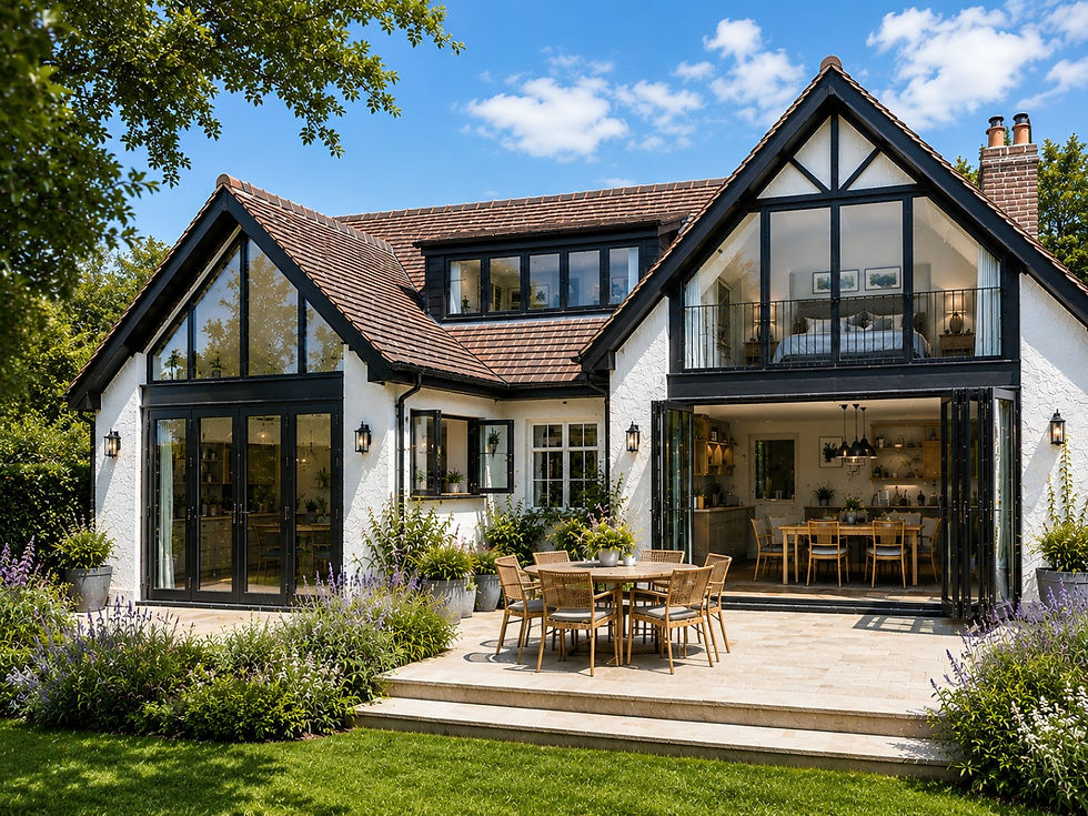
The exterior concept became one of the most important parts of the project. Rather than attaching a completely separate-looking contemporary structure, we explored an extension that continued the architectural language of the house. The pitched roofs and gables remain, while dark-framed glazing introduces a more contemporary element balanced by traditional roof tiles, light rendered walls and strong roof forms.
From the garden, the ambition was for someone to look at the property and think, “Of course that belongs there.” There is substantially more connection between house and garden, but the overall shape still reads as a character home.
And no glass roof
This was a specific part of A&R's brief. They wanted light, but they did not want the extension to depend on large panes of overhead glazing. So the concept uses windows, glazed doors, views and the architecture itself to create that connection. A bright extension does not automatically mean a glass-roof extension.
Reimagining the kitchen: creating the heart of the house

The new kitchen and dining space was where we could really rethink how A&R might live in the house day to day: cooking, breakfast, homework, friends coming over, family dinners and doors open to the garden in summer.
A long island provides preparation space as well as informal seating, while a proper dining area sits beyond it. Wide openings towards the garden mean the view becomes part of the room. Darker cabinetry, timber flooring, traditional details, brass and warm lighting stop the scheme feeling like an ultra-slick showroom kitchen. It is modern where modern makes life easier, and traditional where tradition gives the house warmth.
When planning a kitchen extension, do not begin with “How big can the island be?” Begin with “What do we actually want to happen in this room?”
The hallway: using space that already exists
Before

The original hallway is a great example of why maximising space is not always about extending. There was already a considerable amount of floor area here. It just was not working very hard.
Reimagined

Our concept treats the hallway as part of the home rather than the gap between rooms. The existing staircase becomes an asset. A warmer, more consistent material palette creates a visual link between original and new spaces, while a long sightline towards the kitchen makes the house feel more connected. The result is not necessarily about making the hallway physically larger. It is about making it feel more useful, more intentional and more connected.
Adding the storage everyday life actually needs

Beautiful houses still need somewhere to put shoes, coats, bags and the dog's lead. One theme we kept returning to was making awkward or overlooked spaces earn their keep. Fitted cabinetry, drawers, baskets, hooks and seating turn practical storage into part of the interior rather than something that has to be hidden.
The living room: modernising without stripping out the cottage
Before

Reimagined

The sitting room had some of the best character in the house: the fireplace, ceiling beams and good proportions. Rather than stripping those details out, the concept makes them central. A softer neutral palette lets the architecture stand out, built-in cabinetry gives previously unused wall space a job, and natural timber, woven materials and muted greens bring warmth. Not every renovation needs to turn a traditional sitting room into an open-plan space. Sometimes the luxury is keeping a proper sitting room.
The principal bedroom: making the gable the feature

This is one of the clearest examples of the project's overall philosophy: if a house has an interesting architectural feature, do not hide it — use it. Full-height dark-framed glazing follows the pitch of the roof and makes the gable the defining feature of the room. Inside, warm neutrals, timber, soft upholstery and traditional lamps remain deliberately restrained so the architecture can do the storytelling.
The second bedroom: designing for the person using it
Before

Reimagined

We did not want every bedroom to become a slightly different version of beige. This concept has a darker, more individual mood with integrated shelving, a proper desk under the window, storage and subtle lighting built into the joinery. The sloped ceiling becomes part of the design rather than wasted space, and the room works as both a bedroom and a place to study or work without feeling like two unrelated zones.
A calmer take on the main bedroom

We also explored a softer bedroom direction. Full-height fitted cabinetry turns storage into part of the architecture, an original-style fireplace adds character, and natural textiles and timber bring softness. It is a useful reminder that more floor space does not require more furniture. Sometimes leaving space around things is what makes a room feel luxurious.
Keeping the cottage recognisable from the outside
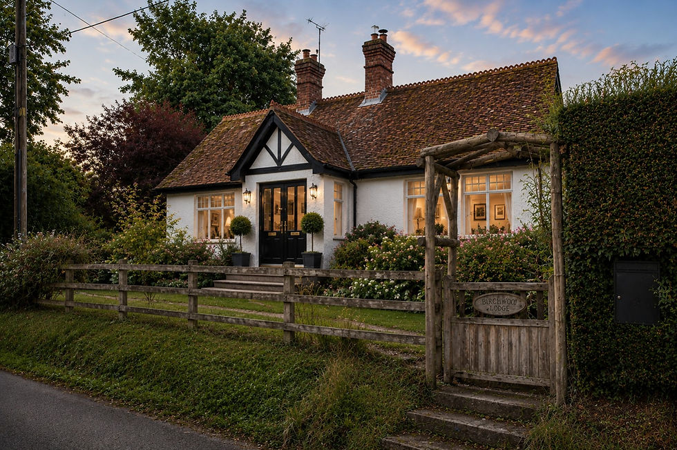
While the rear of the house offered opportunities for bigger architectural changes, the front was intentionally more familiar. The gable detailing, light exterior and clay-toned roof keep the house rooted in its cottage character. The aim is for it to feel cared for and brought forward rather than replaced.
What visualising the renovation changed
This stage was not intended to replace an architect, structural engineer or technical designer. It had a different job. A&R needed to see ideas before deciding which ones were worth developing further.
Visualisation turns questions such as “What if we opened this up?”, “Could the gable become glazing?”, “Could this room fit storage and a desk?” and “Would a big extension still feel like our cottage?” into something you can actually react to. Some ideas become obvious. Some suddenly feel wrong. Others create completely new conversations. That exploration is valuable before the expensive part begins.
Five renovation ideas we'd take from the A&R project
Identify what gives the house its character before changing anything. For A&R, the gables, fireplaces, beams and roof forms were features to build around rather than remove.
Maximise the space you already have before assuming you need more. Hallways, alcoves, sloping ceilings and circulation areas can all work harder.
Light does not have to mean a glass roof. Windows, glazed doors, sightlines and well-positioned openings can transform how bright a space feels.
Modern and traditional do not need to compete. Contemporary glazing and fitted storage can sit alongside fireplaces, timber and traditional proportions.
Visualise expensive decisions early. It is far easier to change an idea than a building.
The outcome: a direction, not a finished blueprint
A&R came to us with a renovation project that had started to feel increasingly expensive and increasingly difficult to picture as a finished home. The aim was not to hand them a construction-ready answer. It was to give them a direction: a way of seeing how the original cottage could remain recognisable while becoming substantially more useful, a way of testing whether the gables could drive the design rather than constrain it, and a way to imagine warm modern interiors without losing the character they bought the house for in the first place.
Before asking “How do we build it?”, sometimes you first need to answer: “What do we actually want it to become?”
See the full A&R renovation inspiration
We have collected the A&R concept imagery and wider renovation inspiration together on Pinterest.
Planning a renovation but struggling to picture the possibilities?
M&M helps homeowners explore ideas visually before they commit to the next stage — from rethinking awkward rooms and layouts to imagining how extensions and interiors could work together.
Concept visualisations are intended for creative exploration and design direction. They are not architectural, structural, planning or construction drawings. Any proposed changes should be assessed and developed by the appropriate qualified professionals before work begins.


Comments